
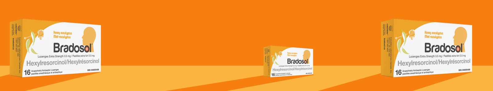
Our Client’s Challenge
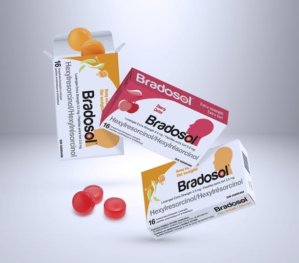
Bradosol had previously held the position of #1 lozenge brand nationally—but it had been off the market for a few years. Our client wanted a packaging refresh that would help re-launch the brand and capitalize on its trusted familiarity.
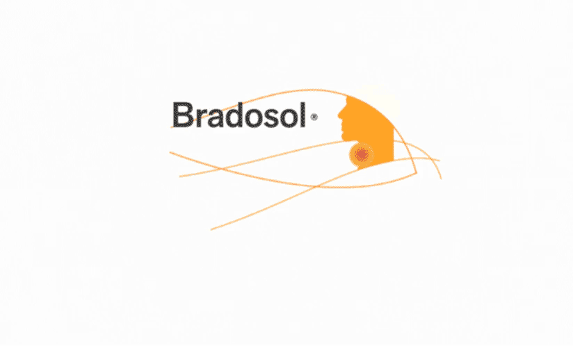
Our Strategic Insight
In previous iterations, the Bradosol package had featured a head silhouette with a hot spot on the throat. We realized this was an important reference linking the brand to its longstanding consumer recognition.
Our Solution
To entice former fans back into the Bradosol community, we needed to present a bold and fresh look—while maintaining a strong link to its past. The "hot spot" silhouette was blended into the modernized word mark, which ensured consumers would recognize the “new-look” Bradosol as the brand they loved and trusted.
The package was thoroughly revised to bring it fully into conformance with both the new Health Canada Plain Language Labelling (PLL) requirements, and Quebec Bill 96 French-language regulations.
The Results
With its refreshed new look, the revived Bradosol was soon available in convenience outlets nationwide, as well as online on Amazon, and its own eCommerce website!