

6 Ways NHP Brands Can Win Consumer Attention, Despite New Health Canada and Bill 96 Labelling Requirements
Highlights of this article
1 - Create a strong bilingual wordmark
2 - Use imagery that speaks eloquently
4 - Direct the consumer's eyes
5 - Organize, organize, organize
Have you looked at the new Health Canada and Quebec Bill 96 labelling regulations and said, "Okay then, that's the end of branding!"?
Are you wondering how your Natural Health brand can excite consumers, when every square inch of the package is going to be covered with obligatory details, including a Product Facts Table?
We've seen marketers throw their hands up in despair trying to figure out where to put all the required "product facts" within the limited territory on their packaging.
The good news is that there's always a way.
The not-so-good news is that it's never easy. Every element of a packaging design project is fraught with potential hazards at the best of times. And with the new regulations, we know it can seem even harder. But with the right approach and attention to detail, your branding and packaging can resonate even more powerfully with consumers than it does today!
Consider the following six principles our team at brandigital has used to ensure the brand stands out powerfully—while conforming fully to the new regulations.
We’ll illustrate the principles with an actual packaging update project we managed here at brandigital, from start to finish. The project was to bring an existing OTC product into conformance with the Plain Language Labelling (PLL) requirements for non-prescription drugs (which are even more stringent than those for NHPs).
1 - Create a strong bilingual wordmark
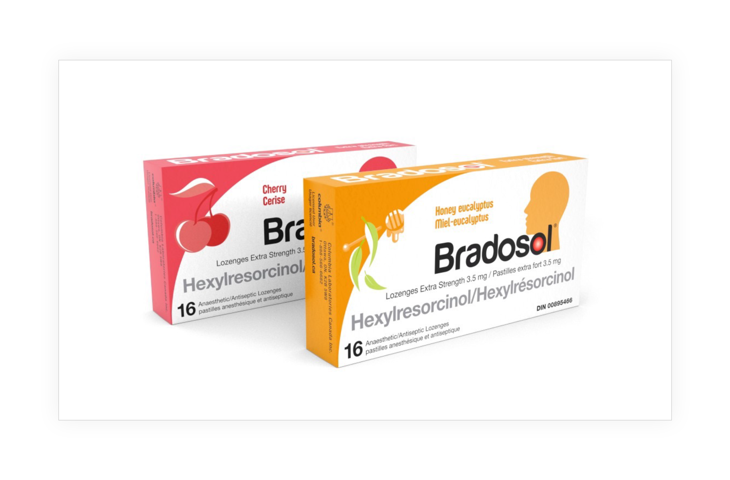
When brandigital was given the assignment to update the packaging for Bradosol®, the medicated lozenge brand, we also won the opportunity to refresh the logo and wordmark.
The Bradosol name had been known and respected in Canada for over 50 years. One consistent branding element was the “hot spot” on the user’s throat—which can be seen here on the previous packaging:
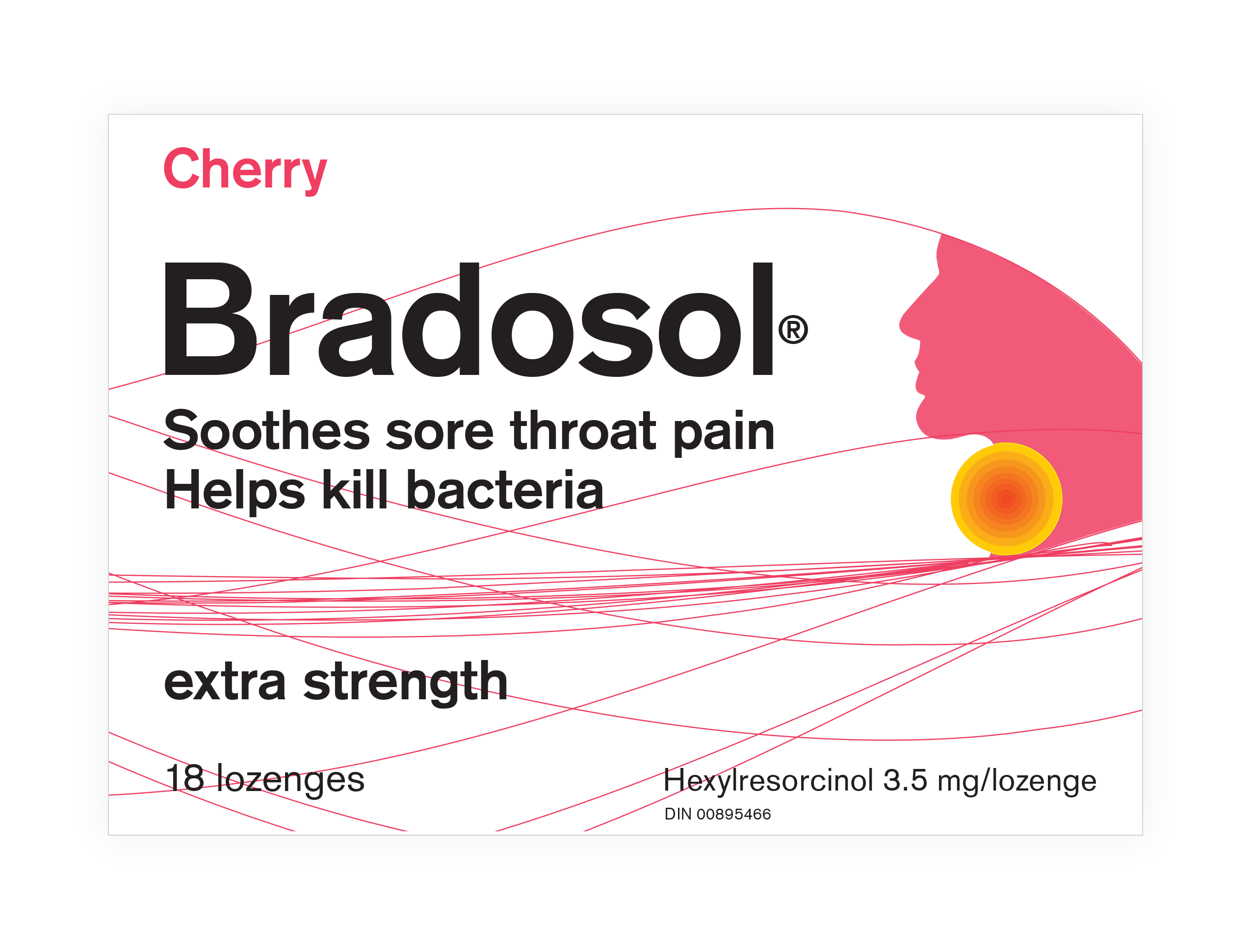
This was definitely something we wanted to keep as a recognizable symbol of the brand and its soothing effect on rough, sore throats. We also wanted to unify the wordmark with the iconic graphic, both to enhance the impact, and to reduce the space needed for strong branding.
Talking with long-time fans of the brand, we learned that what they loved, aside from the effective sore-throat relief, was the great tasting flavours of Bradosol lozenges. More mellow and pleasant than other medicated lozenges, Bradosol was uniquely appealing to those who knew and remembered the brand.
So, we augmented the logo with an opportunity to flag the flavours in both English and French words, as well as with impactful graphics that would illustrate the flavours visually. The result was strong branding with an instant flavour-profile association.
This tight, powerful combination of imagery and words was the first step in solving the bigger puzzle: How to fit all required content on a compact box that can easily be carried in a consumer’s pocket or purse?
2 - Use imagery that speaks eloquently
For any product in this category, the first question in the consumer’s mind is, “What will it do for me?” That’s the nature of natural health and OTC products: they exist to solve a problem, enhance health, or provide relief.
With limited space and a lot of details fighting for it, the best way to answer that question immediately is with pictures. Images not only replace words, but they communicate ideas faster.
Placing the “hot spot” within the “o” of Bradosol, and positioning it on the throat of the iconic head silhouette allowed us to flag the efficacy of the product in a way that communicated it clearly.
This approach also provided a simple means to colour-code the flavours by displaying the head profile in a different colour on each pack: hot pink for Cherry… warm orange for Honey eucalyptus.
3 - Find the right balance
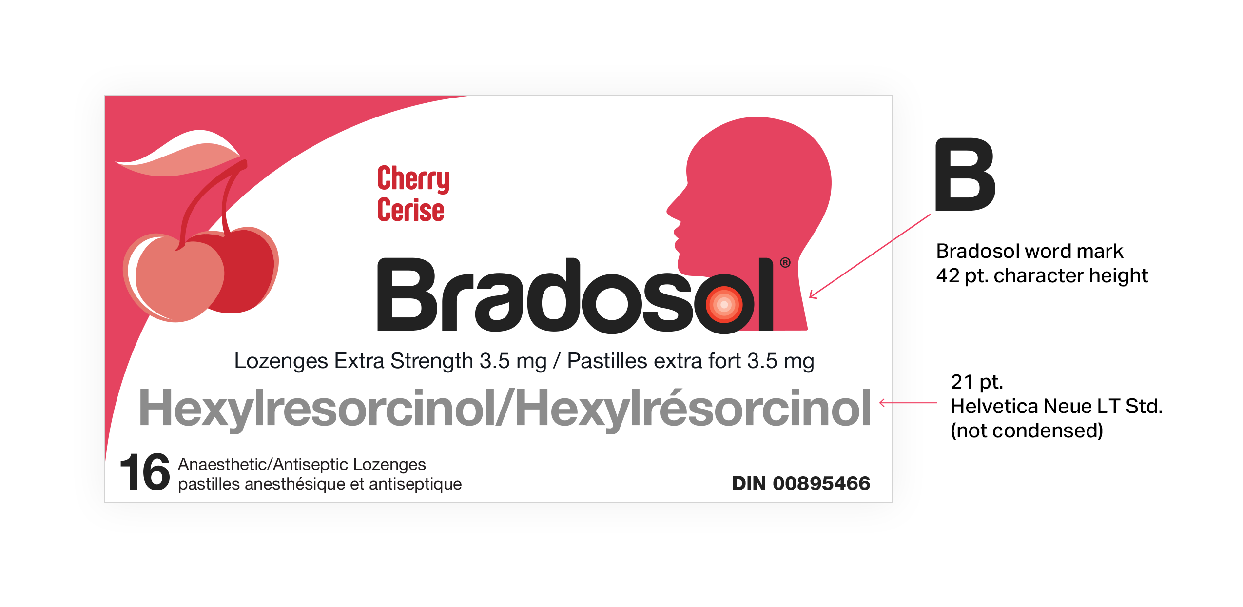
Health Canada and Quebec’s labeling requirements can be very stringent about specific approved fonts and sizing. One example is the requirement that “the proper or common name of the drug product, [must appear] in a font size not less than half the size used for the brand name.” 1
In this case, “the proper or common name” being the one listed in the product monograph registered with Health Canada. (Once the name is in the monograph, you can’t decide to alter it, unless you re-submit.)
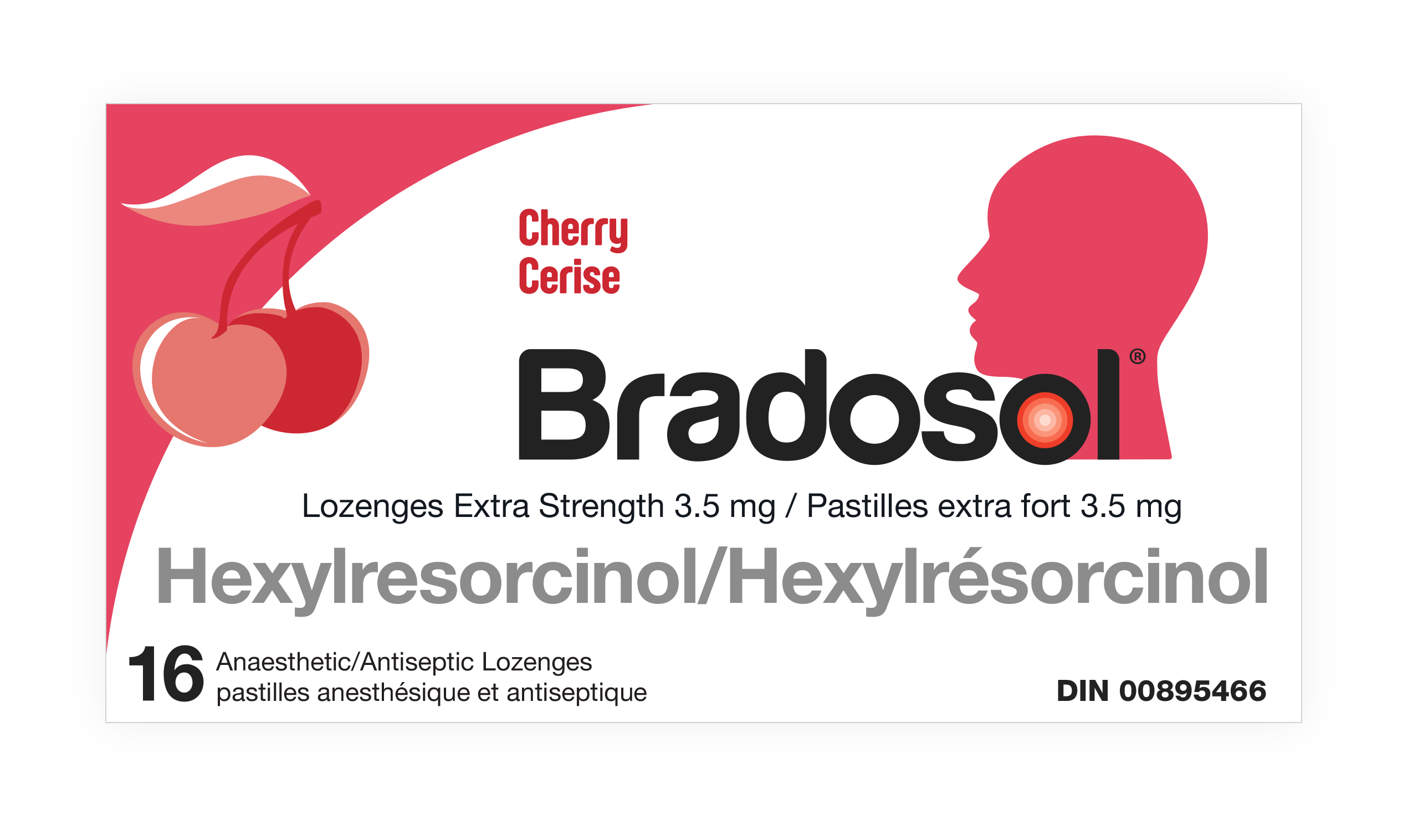
For Bradosol, we were informed that the common name of the drug product was Hexylresorcinol—an ingredient with the dual benefit of an anaesthetic (to relieve pain) and antiseptic (to kill germs).
You can imagine that this demanded significant space. The regulations don’t stop there, however. Other elements required on the package front are: dosage form, dosage strength, quantity, and Drug Information Number (DIN). Since we needed the back panel for the Drug Facts Table, it all had to be bilingual, English and French on one panel. This was a departure from previous Bradosol packaging, which had separated the English and French fronts on opposite sides of the pack.
This presented a challenge of balance, for sure. Luckily, with the strong branding provided by the unified wordmark and graphic iconography, we were able to devote almost half of the front panel to these details and yet maintain the height of the Bradosol wordmark at a very readable 42 points.
4 - Direct the consumer's eyes
Part of winning the war on balance is the art of directing the consumer’s eye to the elements you want them to focus on, in order.
The tricks for this in the designer’s kit bag include the use of angles, curves and strategic white space to control eye movement.
On the Bradosol box, our art director added a dramatic curve of solid colour in the top left corner, flowing up and to the right. This directs attention to the head silhouette on the right, integrated with the brand wordmark.
The head profile is, in turn, looking back to the left, where the flavour is highlighted in both words, and images. Finally, the whole structure is supported on the solid foundation of the drug-product name in English and French, running the full width of the panel.
5 - Organize, organize, organize
At first blush, the obligatory content requirements of the Product Facts Table can seem daunting. There are restrictions on font styles, size, formatting, character spacing, and even the thickness of the lines that are required to separate the cells.
Careful organization is key here.
The first thing to consider is whether you can arrange your content to have one bilingual front panel—referred to as the “principal display panel.” Remember that under Quebec’s Bill 96, French must not be given lesser prominence than English.
This bilingual arrangement opens up opportunities to employ a number of flexibilities. For instance, your package would be eligible to use “innovative labels,” which are considered as extensions of the main label.
You should carefully study the “Flexibilities” section of the Guidance document to see what other options you may be able to take advantage of.
Combining English and French in one bilingual Product Facts table, is another option that may save space, although for consumer readability, separate English and French tables are preferable—ideally side-by-side.
Another consideration is whether the wording can be edited shorter—while, of course, maintaining the mandated phrasing that Health Canada has approved in the product monograph.
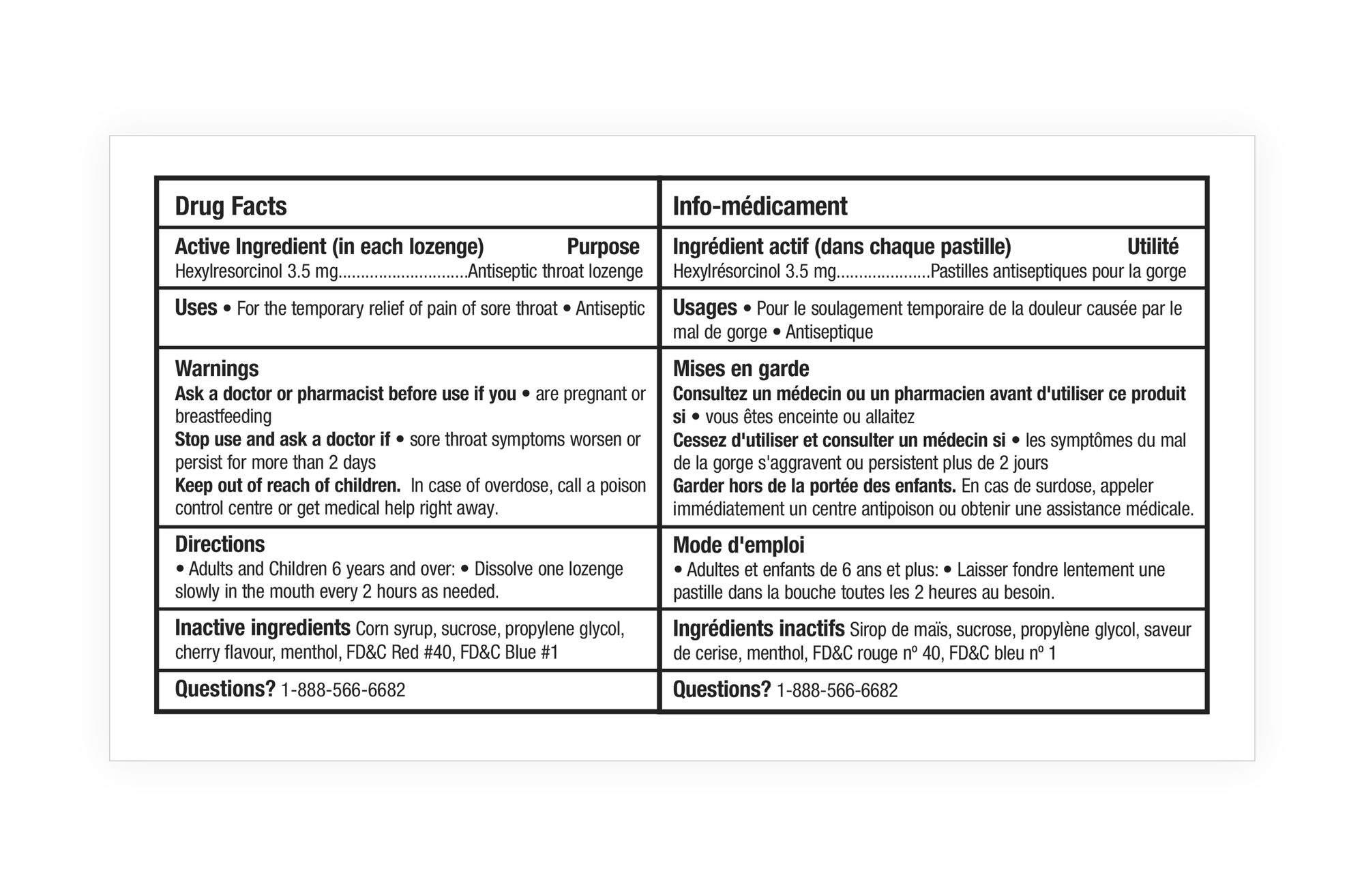
While strictly following the requirements, we were able to employ numerous flexibilities in the Bradosol Drug Facts Table, resulting in a side-by-side chart that fit comfortably on the back panel—which was cleared for that purpose by creating the bilingual front panel shown above.
6 - Use every space wisely
With the bilingual branding panel on the front, and the Drug Facts Table covering the whole back panel, we then looked for opportunities to display the brand’s unique selling proposition, and other product differentiation statements.
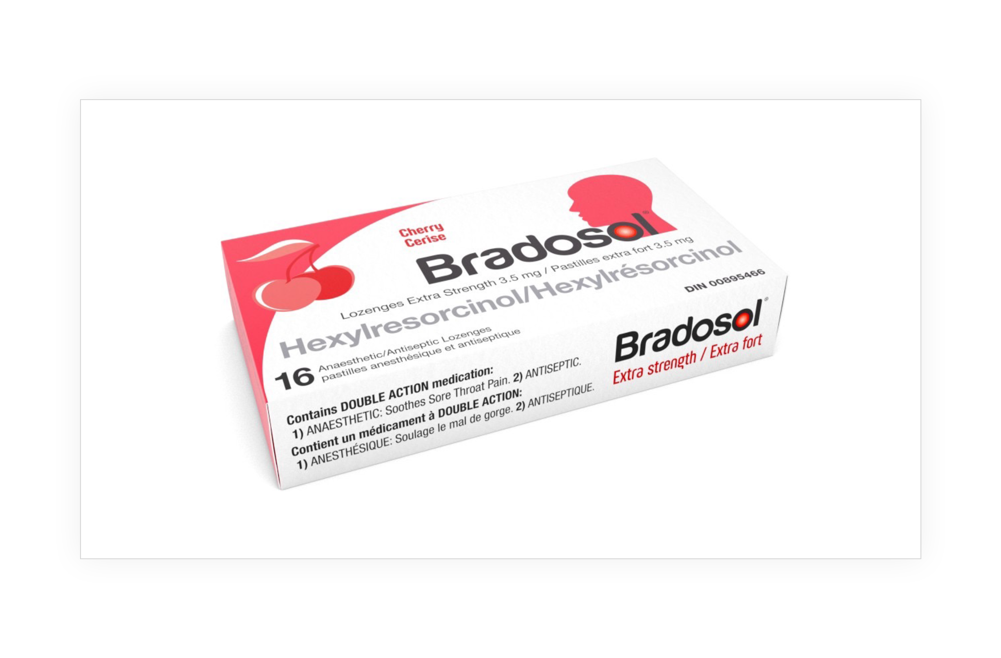
For this we were able to use the bottom panel to reinforce the “Extra strength” dosage, along with a strong statement about the double action of the active ingredient: both soothing action for sore throats, and antiseptic action to kill germs.
The net result is a package that works harder to get the attention of the consumer, and to provide them with the factual information they need to make a positive purchase decision!
We hope these six principles will help you look at the new regulations as an opportunity, rather than a restriction on the strength of your brand messaging on store shelves.
Have you had a similar packaging update experience (good or bad)? Participate in our easy poll and see how others have responded!
Sources cited in this article:
Guidance document: Labelling of natural health products
Labelling requirements for non-prescription drugs guidance document
How Bill 96 Impacts Bilingual Labelling in Canada - Quality Smart Solutions